You are not logged in.
- Topics: Active | Unanswered
Pages: 1
#1 Nov 27, 2010 9:43 PM
- SpyroroxThe2nd
- Member

- From: Dragon Temple, hangin' with th
- Registered: Aug 10, 2009
- Posts: 87
- Gems: 0
Art Style
Hey guys,
What do you think the art style will be like/should be like in this game? Personally, I didn't mind dotd art, in fact I thought the scenery was very well done, but I did NOT like how they redid the guardians... and I wasn't a big fan of Spyro's design either.
Chillin' like a dragon.
Offline
#2 Nov 27, 2010 9:45 PM
- Scarlett-Fear-Dragon
- Member
- From: EN-GA-LAND!
- Registered: Mar 16, 2009
- Posts: 531
- Gems: 0
Re: Art Style
I think they should keep it quite simple like in AHT but with detailed graphics like in DotD.
Donate gems to me, biatch, and I give you cuddles.
Offline
#3 Nov 27, 2010 9:53 PM
- JazzJackrabbit
- Member
- Registered: Jun 20, 2010
- Posts: 1,120
- Gems: 0
Re: Art Style
I'ma big fan of LOZ: Wind Waker style cel-shading. It's simple and crisp, and everything looks how it is supposed to. I think that might work for Spyro. Another style I'd go for is the PS1 polygons, with hi-res textures, and lighting effects that aren't as strong as they are in DOTD.
Yo, Spyro
I'm really happy for you, but Jazz Jackrabbit is one of the best platformers of all time.
OF ALL TIME!
Offline
#4 Nov 28, 2010 12:09 AM
- ~cornys~
- Member
- From: Zanesville, Ohio (USA)
- Registered: Nov 16, 2008
- Posts: 761
- Gems: 0
Re: Art Style
I hope they have the correct one for the series it's placed in. If it's LoS with the orig. graphics then it's a fail, and reverse would also be a fail.
If tomorrow may never come, and yesterday is just a memory, then what is today worth?
-Cameron (Cornys) Corns
Offline
#5 Nov 28, 2010 12:40 AM
- riverhippo
- Member
- From: Dallas, Texas, USA
- Registered: Apr 10, 2010
- Posts: 2,077
- Gems: 1,093
Re: Art Style
Strong Hind Legs??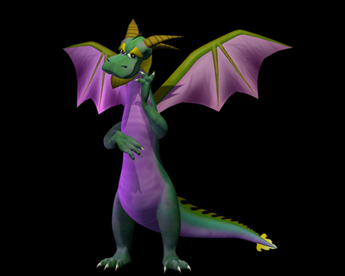
Or Typical Dragon Quadruped?

Wake me up... when September ends is here...
Offline
#6 Nov 28, 2010 1:06 AM
- JazzJackrabbit
- Member

- Registered: Jun 20, 2010
- Posts: 1,120
- Gems: 0
Re: Art Style
I think there's a bit more nostalgia and originality in the Spyro 1 dragons. That first dragon Riverhippo posted almost looks cel-shaded.
Yo, Spyro
I'm really happy for you, but Jazz Jackrabbit is one of the best platformers of all time.
OF ALL TIME!
Offline
#7 Nov 28, 2010 1:55 AM
- riverhippo
- Member

- From: Dallas, Texas, USA
- Registered: Apr 10, 2010
- Posts: 2,077
- Gems: 1,093
Re: Art Style
I think there's a bit more nostalgia and originality in the Spyro 1 dragons. That first dragon Riverhippo posted almost looks cel-shaded.
Just found it. It's like a graphic you'd find in the game manuel or prima's strategy guide.

Wake me up... when September ends is here...
Offline
#8 Nov 28, 2010 9:09 PM
- Jackson117
- Member
- From: Hell
- Registered: Nov 04, 2008
- Posts: 2,307
- Gems: 0
Re: Art Style
I wouldn't really care
Statement: Love is what you get when you lock a target in your sights and watch as the targeting alines and the blaster
Offline
#9 Nov 28, 2010 9:48 PM
- Trasher258
- Member

- Registered: Sep 06, 2007
- Posts: 558
- Gems: 0
- Website
Re: Art Style
The more color intense look in Spyro 2 & 3 didn't do it for me as the lighting in Spyro 1 felt just right. It seemed to be more gentle with the colors.
@riverhippo The same image can be found on an old Spyro 1 site that is still working.
I don't care how it looks but how it functions
Offline
#10 Nov 28, 2010 9:53 PM
- Mr. John
- Member
- From: Idol Springs
- Registered: Feb 12, 2010
- Posts: 8,358
- Gems: -2,720
Re: Art Style
Wonder what they will look like?
You never know how strong you are until being strong is the only choice you have.
Cayla Mills
Offline
#11 Nov 28, 2010 10:20 PM
- riverhippo
- Member

- From: Dallas, Texas, USA
- Registered: Apr 10, 2010
- Posts: 2,077
- Gems: 1,093
Re: Art Style
I wouldn't really care
I think that it charming when you have the perfect balance between a non-human character displaying human-like social and physical qualities of the real creature anatomy without discrediting its nature. Dragons don't grab things like humans, etc.
Little things are cool to me, like idle Cynder in DotD uses her mouth to itch her wing, because there's no way she could reach with her feet.

Wake me up... when September ends is here...
Offline
#12 Dec 09, 2010 9:25 PM
- Spyro22
- Member

- From: U.S. America
- Registered: Feb 05, 2010
- Posts: 417
- Gems: 0
Re: Art Style
They should keep it the same way it was in DoTD, and yes we agree, they should redo the gaurdians. At least Ignitus. They butchered him.
"I didn’t go to religion to make me happy. I always knew a bottle of Port would do that. If you want a religion to make you feel really comfortable, I certainly don’t recommend Christianity."
- C. S. Lewis
Offline
#13 Dec 10, 2010 1:58 AM
- 36IStillLikeSpyro36
- Member

- Registered: Aug 15, 2008
- Posts: 17,365
- Gems: -4,018
- Website
Re: Art Style
besides the fact that they should do some redesigning of the characters:
@yearofthe - i'd prefer if the dragons were quadrupedal, honestly.
as for the art style itself, DOTD all the way ![]() we need more levels like Twilight Falls and the Valley Of Avalar!
we need more levels like Twilight Falls and the Valley Of Avalar!
Dіsсоrd - 7Arterial7Justice7 [[HASHTAG]] 6565
DeviantArt - https://www.deviantart.com/arterialblack716
YouTube - https://www.youtube.com/user/spyrotheet … ght/videos
imperfect sinner saved by Christ.
Offline
#14 Dec 12, 2010 1:17 PM
- Kimbia28
- Member

- From: Croatia
- Registered: Feb 03, 2010
- Posts: 60
- Gems: 0
Re: Art Style
tbh some of the dragons from old Spyro stood on 4 legs =/


so they can all probably be quadrupedal,but they choose to stand on two legs
maybe cus it's easier to gesture that way.
Offline
#15 Dec 12, 2010 8:40 PM
- Aura24
- Member

- From: Artisans
- Registered: Dec 15, 2007
- Posts: 1,476
- Gems: 750
- Age: 33 years old
- Gender: Female
- Website
Offline
#16 Dec 13, 2010 12:02 AM
- Kimbia28
- Member

- From: Croatia
- Registered: Feb 03, 2010
- Posts: 60
- Gems: 0
Re: Art Style
But they can be both quadrupal and bipedal whenever they want.
yes they can :3
Offline
#17 Dec 15, 2010 12:56 AM
- WhiteWind
- Member
- From: Australia
- Registered: Dec 15, 2010
- Posts: 12
- Gems: 0
- Website
Re: Art Style
The style on the dragons in the most recent game makes many of the dragon characters look shiny, in this game i am looking forward to more scale textures and perhaps going back to the typical old designs they used for the guardians in the first 2 TLOS games. Also I still remember the main idea for Cynder was for her to be the "black" dragon, i would hope they continue this rather then the purple because that contradicts the whole meaning of "purple dragon". I do love the background graphics for the 3rd game, I appreciate there are more textures ect, particularly i like the grass in this game. It would help though for more realistic water to replace the water before it as we progress in technology. Dragons have always been either for legged, or without any arms, i would beg to differ on anyone who wishes the dragons in this game to stand on two legs. I also believe it would be a stunning idea to have a natural change of days to nights. Or perhaps just more night leves.
~Regards Whitewind
~WhiteWind~
Kate, 15, Australian, Rodeo Rider, Artist.
Offline
Pages: 1
